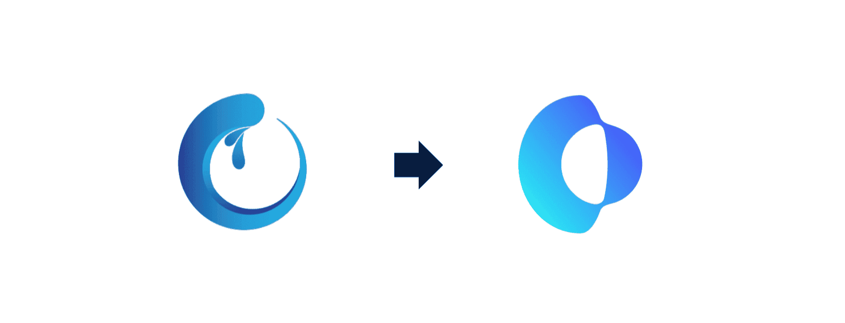
We liked our old logo. It had been with us through the early days of BlueOC, when our team was smaller, our story was still taking shape and every new project helped define the company we were becoming. It appeared in our first conversations, accompanied important milestones and became familiar to the people who built alongside us.
But companies do not remain still, and neither should the way they represent themselves.
A Familiar Story, Drawn More Clearly
As BlueOC grew, our work became broader and more connected. What began as a focused technology team developed into a cross-border organization working with clients and colleagues across Vietnam, Japan and the United States. Our capabilities expanded, our partnerships deepened and the problems we were trusted to solve became increasingly complex.
Our visual identity needed to reflect that progress. The refined logo was created to give BlueOC a clearer and more consistent presence across the many places where people encounter us, from digital products and presentations to events, offices and everyday conversations.
The change was not about leaving the old BlueOC behind. It was about representing the BlueOC that had grown from it.
Designed for the BlueOC We Have Become
A logo is a small part of a company, but it carries a considerable responsibility. It must remain recognizable at a glance while working across different formats, markets and contexts. More importantly, it should feel true to the people and principles behind it.
Our refined identity is simpler, more confident and better suited to the way BlueOC works today. It reflects a company that has matured without losing its curiosity, one that continues to approach technology through careful thinking, open communication and close collaboration.
That balance mattered to us. We did not want an identity that felt disconnected from our past, nor one that tried too hard to announce change. We wanted something that felt naturally BlueOC: thoughtful, adaptable and ready to move forward.
The Same BlueOC, Ready for What Comes Next
Although our appearance has evolved, the commitments behind it remain unchanged. We will continue to understand each challenge before proposing a solution, work as one team across borders and build technology around outcomes that matter to the people who use it.
The refined logo does not replace our story. It gives that story a clearer way to continue.
It represents where BlueOC stands today, shaped by the people who have contributed to our journey and prepared for the possibilities still ahead. As we carry it into new projects, partnerships and markets, it will serve as a reminder that meaningful growth is not about becoming unrecognizable. It is about expressing more clearly who you have become.